

a brief history of spotify's ui and why the removal of the heart icon was their ultimate downfall

There’s a fine line between love and hate—and when it comes to Spotify, I honestly can’t tell the difference. We’re like one of those couples still together out of habit, long past the honeymoon phase, clinging to “remember when it used to be good?”
Because I do.
I remember who Spotify used to be.
I think back to 2013. I’m in my room, bathed in the twinkle of fairy lights and the molten glow of a pink salt lamp, softening the blinding neon green that every 13-year-old theatre kid painted their walls. I’d scroll through Tumblr for hours, reblogging grainy GIFs and moody quotes—serenaded the entire time by the perfect playlist I’d built on Spotify.
But like any bad relationship, I found myself asking:
What happened?
So I went back. I started digging. Through every redesign, every update. One UI change led to another. One design tweak became a pattern. And I think I found it. The moment the spark dimmed.
Let me take you down the rabbit hole.
PART 1: Early Spotify UI (2008–2013)
Before Spotify became a glowing recommendation engine in your pocket, it was simple. A search bar. A star icon. And the quiet thrill of finding a song that felt like it was yours.
1.1 Origins of Spotify (2008)
When Spotify launched in October 2008 (exclusively in Europe), the interface was charmingly practical. It looked like if iTunes had a Tumblr account—dark, minimal, no small talk. The layout was simple: sidebar on the left for playlists and navigation, a search bar on top, a main window in the middle for browsing songs, and playback controls sat at the bottom.1
It was designed entirely for function. Desktop music player meets search engine. You could drag and drop songs into playlists, search for anything, and if something hit, you’d click a little gold star to favorite it. That was it.
There were no social features yet, outside of copying a playlist link and texting it to someone you were in love with but pretending not to be. It didn’t care what mood you were in. It just handed you the aux and stepped out of the way.
That would change.
1.2 The Social Integration Era (2010–2012)
By 2010, Spotify started shifting from a solitary listening tool to something a little more social. Its first mobile app launched on iOS in 2009, shrinking the desktop experience into your pocket. But the real turning point came in 2011, when Spotify launched in the U.S. and began integrating tightly with Facebook.234
Suddenly, listening was no longer a private act. A sidebar in the desktop app showed what your friends were playing. There was an inbox where you could send song links back and forth. By 2012, you could follow friends the same way you followed artists. 56
The first sign that our taste was becoming the content.
Spotify’s design stayed list-based and practical, but the emotional tone had started to shift. Music has always been social, but Spotify made that sociality native to the platform. Listening became public by default. You didn’t have to burn a CD or send a playlist anymore. You just played a song, and your friends could see it. Spotify hadn’t introduced hearts yet, but it had already learned: people don’t just collect music. They curate it to be seen.
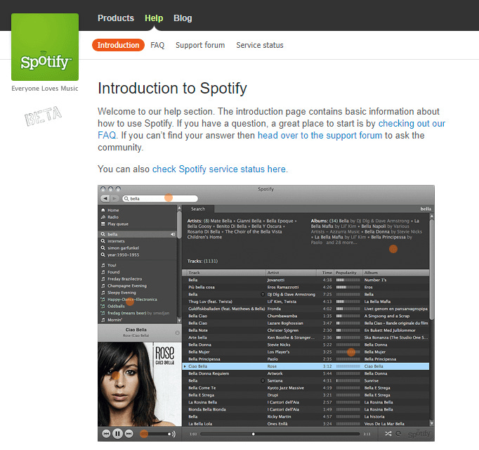
1.3 Discovery and Experimentation (2012–2013)
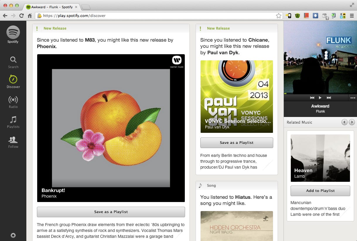
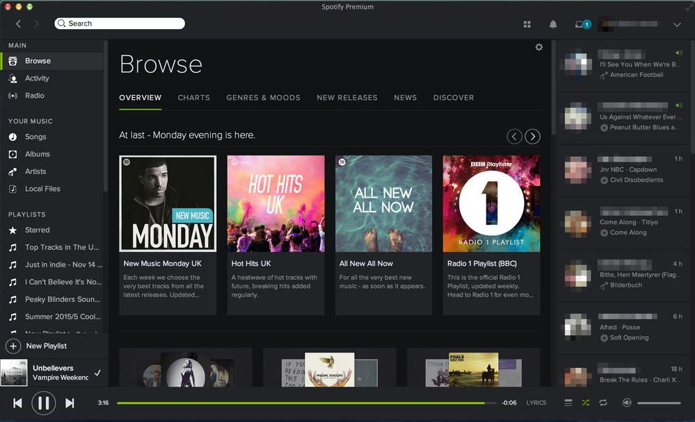
As Spotify’s user base grew, so did its ambitions. Around 2013, a new “Browse” tab and “Discover” page were introduced. This was Spotify’s first real attempts at proactive curation. Instead of just searching for what you already knew, you were now being recommended things. New releases, playlists, suggested artists. Spotify was beginning to think like a tastemaker, not just a search engine.78
PART 2: The Great Redesign and Emotional Turn (2014–2019)
By the mid-2010s, Spotify was no longer a scrappy European music player. It was the streaming platform, expanding rapidly, acquiring users, and competing not just with other music services, but with the legacy of iTunes, Pandora, and even physical mixtapes. So, Spotify didn’t just need to work. It needed to feel like something.
That’s when the UI started to shift from functional to aesthetic, from utility to intimacy. This was the era when Spotify began designing for emotional resonance.
2.1 “Paint It Black”: Spotify’s Major Redesign (2014)
In 2014, Spotify rolled out what it called its “biggest redesign to date”. The look changed dramatically: light backgrounds were replaced by deep, near-black tones. Album covers popped like neon in a dark room. The interface began to resemble a movie theater lobby—sleek, atmospheric, intentionally moody.910
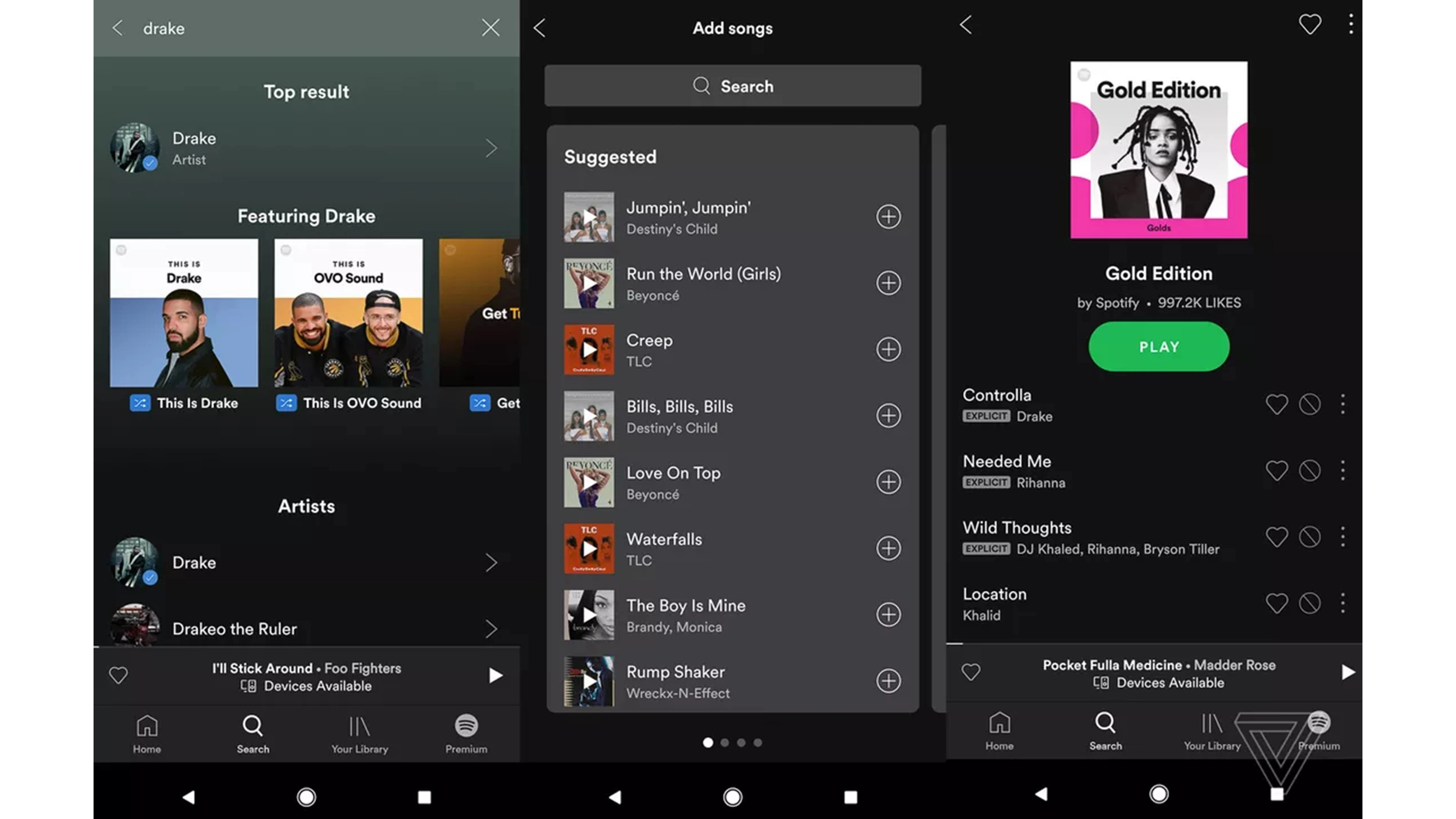
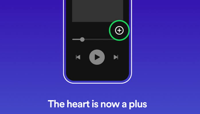
One of the quieter but most symbolic changes was the retirement of the gold star icon. For years, it had been how users marked favorites—bright, maybe a little clunky, but full of personality. But, it didn’t quite fit the new aesthetic. In its place came a plus (+) button. Tap it to save a song to Your Music, and it would turn into a checkmark. Subtle. Clean. Purposeful.11
On the surface, the change was small, but the semantics shifted. The star said, this matters to me. The plus said, this belongs somewhere. The playlist stayed personal, but the act of saving lost some of its soul.
2.2 From Functionality to Feeling: The Rise of the Heart (2016–2019)
It didn’t take long for Spotify to realize that users weren’t just collecting tracks when saving songs. They were expressing a part of themselves. By 2016, the heart icon began appearing across the app, quietly replacing the plus, especially on mobile.
There was no big rollout. No announcement. The heart just started showing up, update after update, and by 2019, it was the default way to save songs, follow artists, and mark albums as yours.12
The heart was intuitive, emotional, already a universal gesture. Instagram had it. Twitter had it. You’d been trained to know exactly what it meant. Clicking it felt like declaring something. I’m saving this. This is part of me.
2.3 The Liked Songs Era: How Spotify Created Emotional Ownership (2019)
In 2019, Spotify made a subtle, but defining update: it redesigned the “Your Library” section and introduced a special, centralized playlist called Liked Songs. This was a turning point.
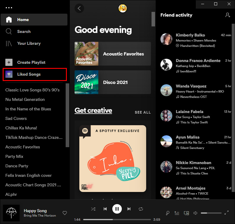
From then on, every time you tapped the heart on a track, it went to one place. Liked Songs became a curated diary of personal favorites. Green hearts appeared next to songs in playlists, albums, and search results instantly signaling you already love this.13
It was smart UX, but more than that it was emotional UX. It reinforced the illusion of ownership. This wasn’t just Spotify’s streaming catalog. This was your collection. The heart icon told you which tracks belonged to you, even if technically you didn’t own a single one.
This was the era where Spotify felt most like a love letter. To your taste. Your history. Your emotional life, song by song.
PART 3: The Peak of Emotional UI Design (2020–2022)
3.1 Micro-Interactions and the UX of Emotion
By 2020, Spotify had evolved beyond a functional streaming service. It had become a masterclass in emotional UI design.
At the center of this shift was a small, almost unnoticeable update: the animated heart.
When users tapped the ♥ to like a track, it animated a celebration of mini heart confetti for a brief moment. This micro-interaction, introduced mid-2020, was literally engineered for delight. According to Spotify’s design team, the goal was to “convey that feeling of excitement you get when you find a song you love.” It literally validated your feelings.14
This is a textbook example of emotional design, a term coined by Don Norman to describe interfaces that not only function well, but also foster emotional connection. And it worked: users liked more songs, curated more carefully, and felt a stronger sense of ownership over their libraries. The heart became a ritual of recognition. A tiny spark of intimacy in an app that had, up to then, prioritized scale and utility.15
3.2 New Features, Same Core Feeling
Between 2020 and 2022, Spotify rolled out a bunch of interactive features that extended its emotional UX philosophy:
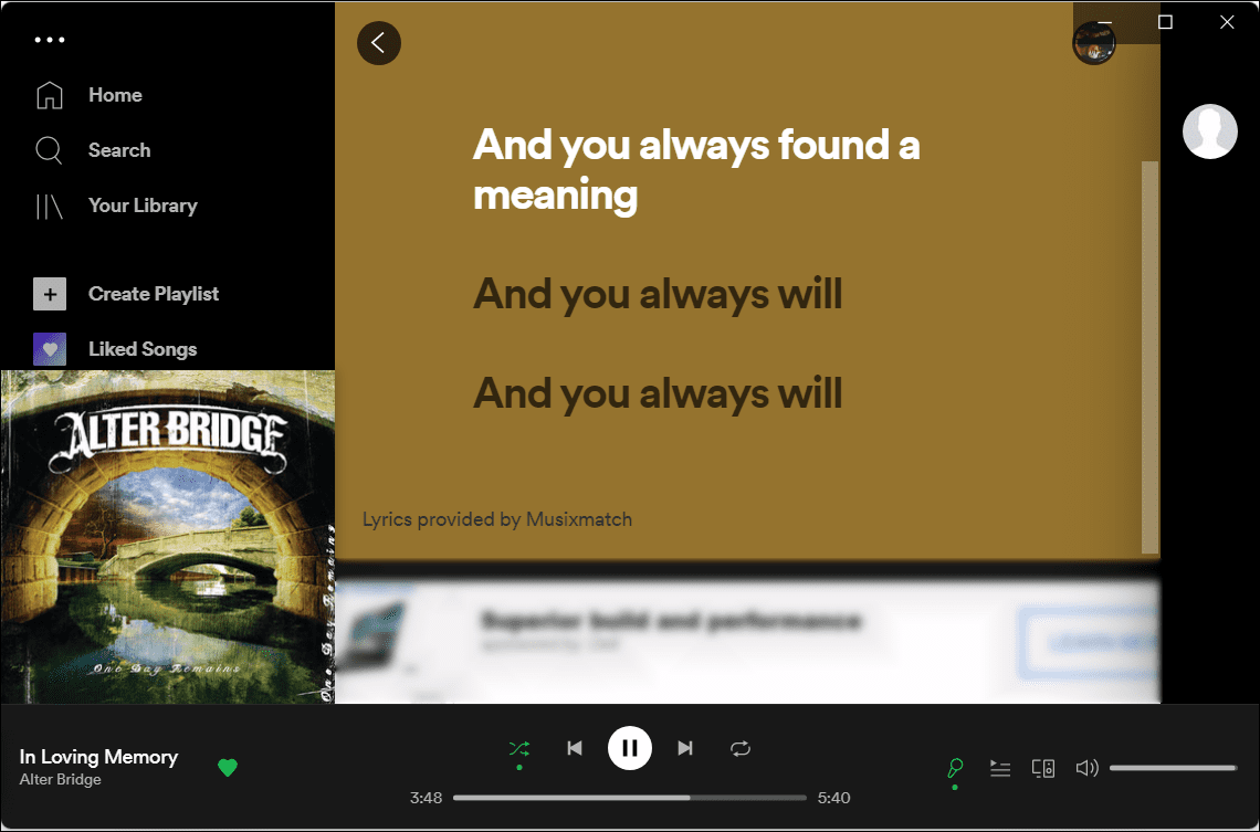
Real-time lyrics (via Musixmatch), transforming the Now Playing screen into a karaoke-style shared experience16
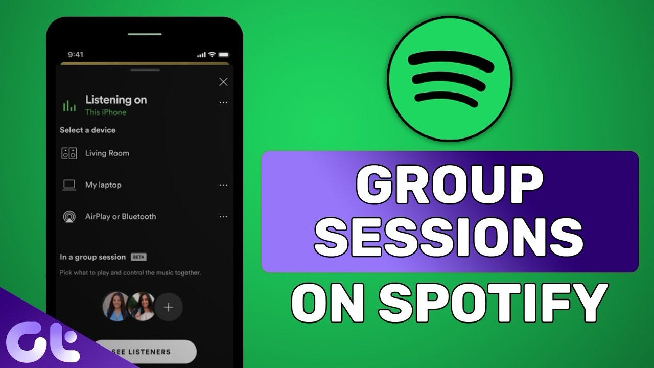
Group Sessions, allowing friends to listen together in real time—an especially timely addition during global lockdowns17

Canvas, where artists could loop short, atmospheric video clips in place of album art18

Each feature deepened the sensory and social layers of the app. These were signals Spotify was designing for immersion. For presence. For vibe.
Yet even with these new experiences, the heart remained central. It was the grounding gesture. No matter how experimental the features became, the heart continued to serve as the user’s anchor point. The emotional nucleus. The act of liking a song still meant something specific, something personal. Spotify was building a richer ecosystem, but the emotional metaphor stayed intact.
PART 4: Removing the Heart (2023)
4.1 The Announcement and Immediate Reaction
In early 2023, Spotify announced it was retiring the heart icon.
The company framed it as an upgrade: a single plus button that would make it easier to save songs and add them to playlists all in one tap. On paper, it made sense. The UI was cleaner, the experience more efficient. For a platform managing millions of tracks and user interactions per second, it was a logical move.1920
But for users, it wasn’t just a button change. It felt like a betrayal.
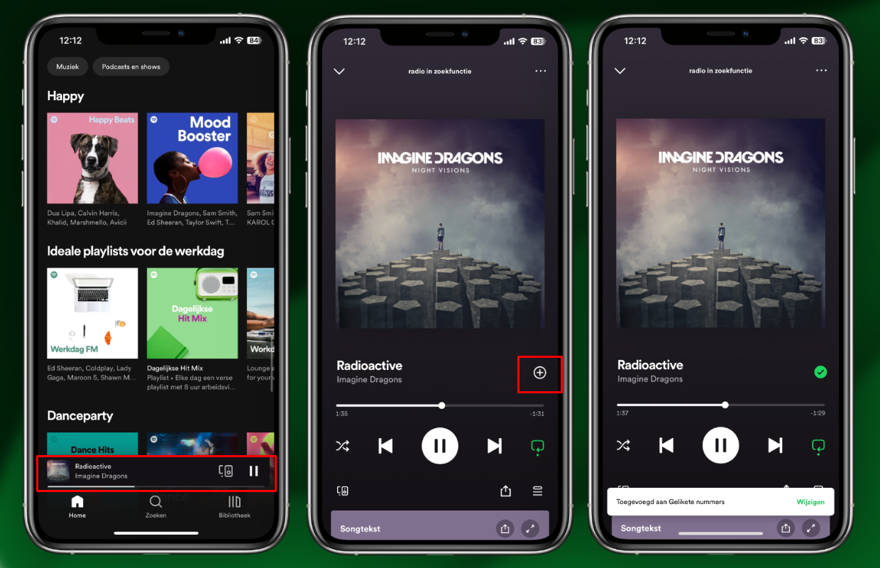
Backlash hit fast. Reddit threads filled with nostalgia for the green heart. Comment sections lit up with people mourning what felt like the loss of something personal. The tech press took notice, too. Headlines in The Verge and TechCrunch questioned why Spotify would remove one of the few symbols in tech that still felt human.2122
The decision might have been practical, but it didn’t feel neutral. It felt like something was being taken away.
4.2 The Loss of Symbolic Meaning
I know it sounds dramatic, but I miss the heart. I really do. I used to like and unlike songs over and over again just to watch the animation play.
Like I really loved it.
The heart felt like claiming something. A flash of recognition between me and the song. The plus feels like filing it away.
Spotify says the new icon does more, and maybe it does, but the heart did something the plus never will: it made a digital gesture feel human.
You can still save songs. You can still build playlists, but it doesn’t feel the same because now you’re organizing your library instead of falling for it.
And maybe that’s the whole point. Maybe it’s not supposed to feel like yours anymore.
4.3 Functional Gains, Emotional Losses
The plus button isn’t bad. It actually does more. It lets you save a song and add it to multiple playlists in one tap without digging through menus or navigating to each list manually. For people who organize their Spotify like a database, that’s genuinely useful. Even I love that part. It makes curating easier. Faster. Sharper.
But the tradeoff wasn’t technical. It was emotional.
The heart was about ritual. It was about the small, private act of claiming a song as yours. It was a moment of resonance—pressed mid-walk, mid-tears, mid-midnight.
The plus, by comparison, is productive. It does the job, but it doesn’t mean anything. It turns what was once an expression into a task. And in that shift, something quietly broke. The interface got smoother and the feeling disappeared.
Spotify tries so hard to see us. It gives us playlists “made for you,” an AI DJ with your name in its script, a year-end Wrapped that reads like a horoscope. It tracks every skip, every loop, every song you almost liked, but not quite.
But none of it ever actually feels like it knows you.
The heart did.
It didn’t need data to prove it. It just let you say this is mine, and that was enough.
No algorithm. No performance. Just one click that felt like a feeling.
And now it’s gone.
PART 5: Ownership, Illusion, and Reality
5.1 The Ownership Illusion Explained
For years, Spotify’s interface worked hard to make us feel like the music we listened to was ours. The playlists we made. The Liked Songs folder. The little green heart. These weren’t just organizational tools. They gave us the illusion that saving a song meant keeping it. That it belonged to us in some way.
And the UI rewarded that belief. The heart didn’t just turn green. It sparkled. You got a dopamine hit every time you saved a song, built a mix, or hit play on something the app said you’d love. It was designed to feel like ownership, even if nothing was ever really yours.
The illusion worked because it didn’t ask you to look too closely.
5.2 Why Losing the Heart Shattered the Illusion
When Spotify replaced the heart with a plus, it didn’t just redesign the interface, it redefined the relationship.
Before, saving a song felt personal. Tapping the heart was a gesture. It said: I love this. This belongs to me, somehow. There was a quiet magic in that. It made streaming feel more permanent, more intimate like you were collecting something real.
The plus doesn’t offer that fantasy. It’s clinical. It’s efficient. It says: This song has been successfully added to your database. It’s not love. It’s filing. A fling.
And in that shift, the illusion cracked because the truth is, you don’t own any of this. You never did.
Streaming is a lease. You don’t own music. You access it, temporarily, through servers and contracts and backend systems you’ll never see. If licensing changes, your favorite track can disappear overnight. If the app goes down, your “library” goes with it. And that was always true.
The heart let us ignore that.
It let us pretend that our music meant something more. That saving a song made it ours. That clicking ♥ was an emotional act, instead of just a backend request.
The plus doesn’t play along. No ritual. No romance. No illusion of permanence.
Just a reminder that this was never yours.
Not really.
PART 6: Spotify vs. the World: Comparing UI Strategies
6.1 Apple Music, YouTube Music, and Others
Spotify isn’t the only player in the game, but it’s one of the only ones that gave up on emotion.
Apple Music still uses a heart. You can “love” a song to signal personal connection and use the plus icon separately to add it to your library. The emotional and the functional live side by side. YouTube Music goes with a thumbs-up—arguably clunkier, but still clearly expressive. Even SoundCloud has a like button shaped like a heart.
These platforms get something Spotify seemed to forget: we want to feel something when we press a button. We want to be understood.
6.2 The Industry’s Emotional Design Trends
In the broader world of UX, emotional design is still trending up. Instagram’s entire economy runs on hearts. TikTok’s engagement hinges on immediate, intuitive likes. Even productivity tools are borrowing emotional metaphors. Notion adds confetti. Duolingo sends you push notifications that feel like a clingy ex.
Because it works. People don’t just remember utility. They remember how something made them feel.
And yet, in 2023, Spotify made a conscious choice to walk away from that. At a time when most platforms are investing in softness, delight, and emotionally rich micro-interactions, Spotify doubled down on logic. It made its saving gesture more efficient, but less expressive.
PART 7: How the Plus Icon Reflects Spotify’s New Identity
The plus button landed at the exact moment Spotify was evolving into something much bigger than a music app.
By 2023, Spotify had fully launched audiobooks, doubled down on podcasts, and introduced a TikTok-style discovery feed on the home screen. You could now swipe through looping previews of songs, video podcast clips, and audiobook trailers, all stacked vertically like stories. The interface had become more dynamic, more interactive, more platform-like. More everything.23
Even the AI DJ was designed to be your personalized guide, narrating back your own taste in between tracks. And sure, it was clever, but it mostly just played the same music you already liked, repackaged with a personality. Spotify wasn’t curating anymore. It was just reflecting.24
The plus icon asks what you want to do with your media. It doesn’t ask what you feel. The UI has become about managing content—organizing, adding, distributing—rather than experiencing music as an emotional event. In Spotify’s new identity, music isn’t the main character. It’s just one media type in a catalog.
Spotify’s identity used to be rooted in feeling. Music is about mood, memory, moments, and Spotify’s design reflected that right down to the animations, the personalization, the way it made a click feel like a connection. Now, the app feels increasingly like a system. A well-oiled, multi-media content delivery platform.
Which it is.
The plus icon isn’t just about saving songs. It’s a symbol of where Spotify is going. Away from romance. Toward utility. Away from ownership. Away from the intimacy of music you love, toward the frictionless management of content.
And in that frictionless world, the things we once felt deeply start to disappear—quietly, efficiently, one icon at a time.
PART 8: The Performance of Knowing You
8.1 Attempts at Emotional Replacement
Spotify didn’t just take the heart away and call it a day. It tried to replace the feeling. To backfill the emotional gap with features that feel personal on the surface, but land like performance.
1) The AI DJ: A synthetic reflection of you
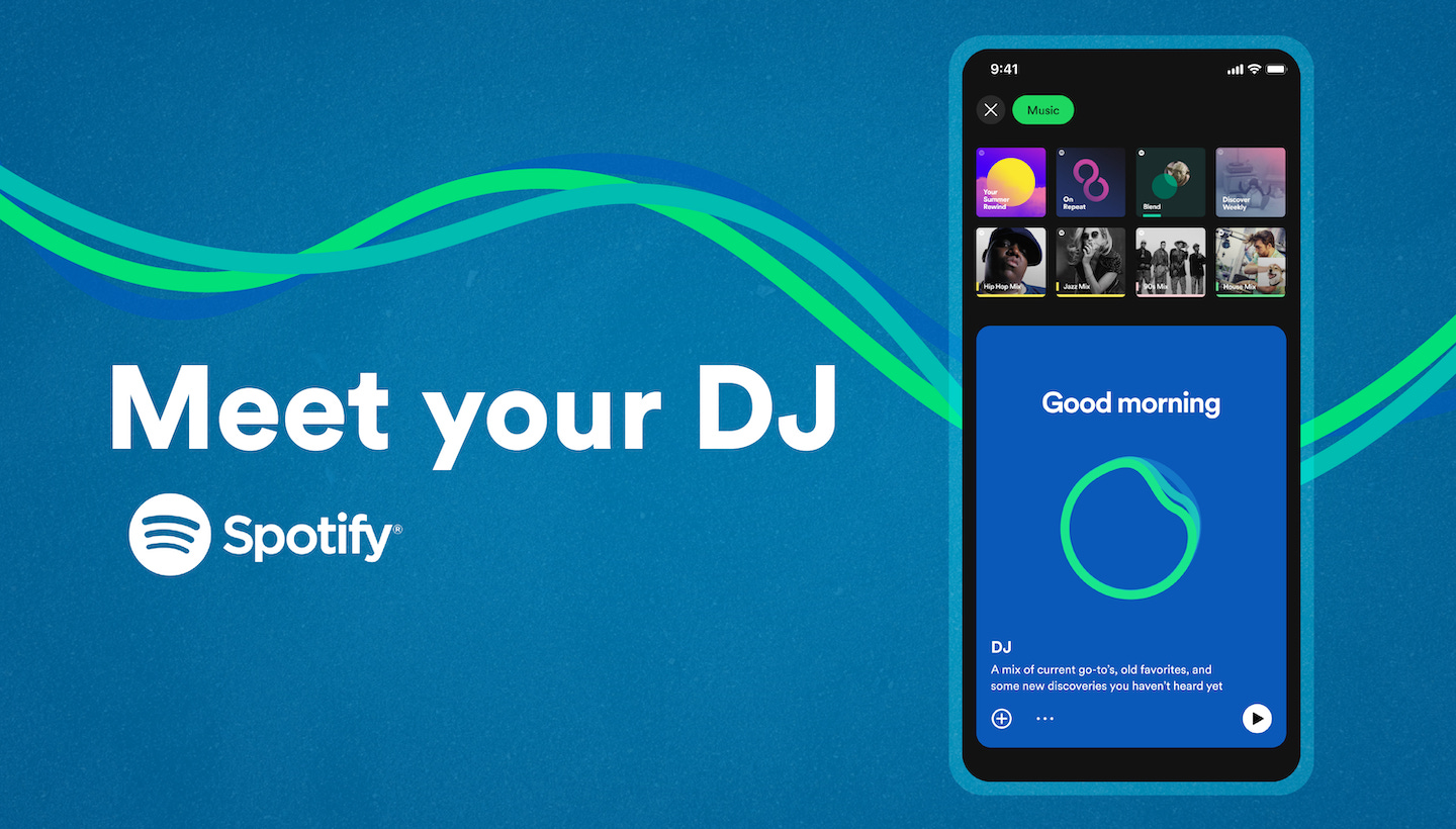
Spotify’s AI DJ calls you by name. It plays your recent favorites with a chill, radio-host voice and occasionally tosses in a “Hey, looks like you’ve been into some indie pop lately.” It’s smooth. It’s technically impressive, but it doesn’t feel intimate.
It’s a mirror. Just playback.
The AI DJ doesn’t know you. It just knows your data, and when it plays the same songs you already know, in the same order, with the same tone, it stops feeling like discovery and starts feeling like a closed loop.
2) Daylist: Quirky playlists that sound like they know your soul
I’ll be honest, I love a Daylist. They’re ultra-specific playlists with hyper-personal titles like “romcom sunscreen friday night” (mine currently) or “shimmery cottagecore sunday afternoon.” And honestly, the branding is fun. I’ve sent my fair share in the group chat before.
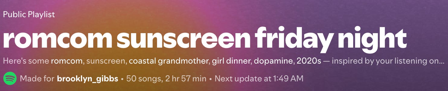
But, it just feels personal. Like a horoscope that’s just vague enough to be scarily accurate.
Once the novelty fades, you realize something: the playlists are just repackaged daily mixes. Slightly tweaked combinations of songs you already like, dressed up in gen-z language. They don’t even fit the “vibe” half the time.
3) Spotify Wrapped: The illusion of memory
Every December, Spotify sends you your life back in slideshow form. Your top songs. Your listening moods. Your aura. It’s playful and colorful. It’s shareable.
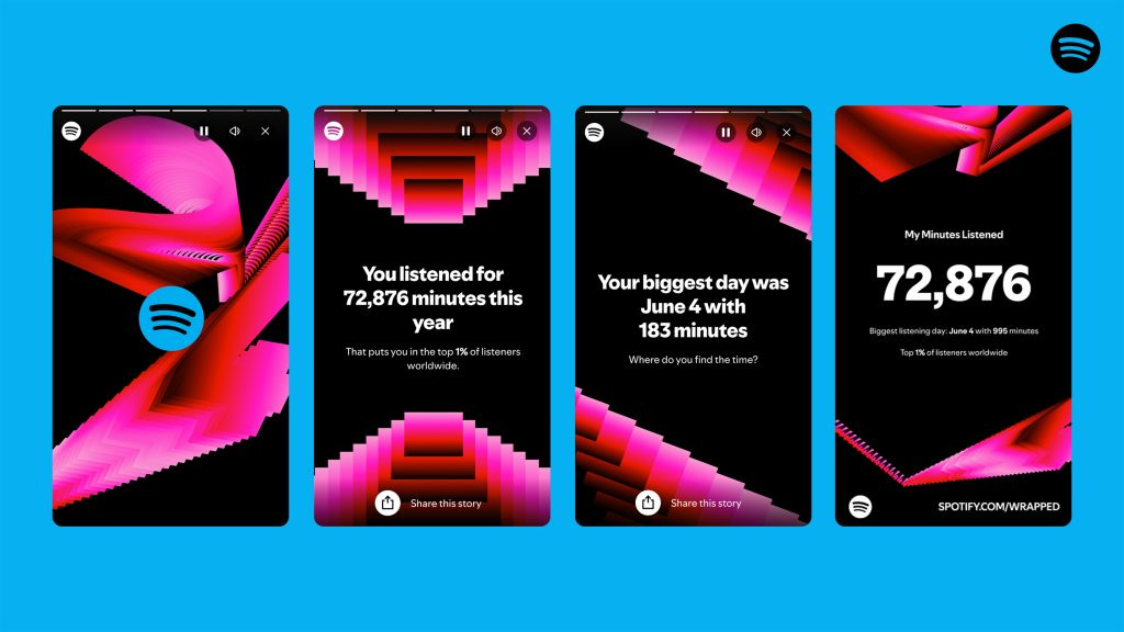
But it’s also… shallow.
And in 2024, people finally started to notice. Headlines from The New Yorker, Wired, and The Guardian called it hollow, uninspired, even algorithmically tone-deaf. My TikTok feed was flooded with disappointed users trying to figure out if the data was even accurate. Wrapped used to feel like a celebration. Last year, it just felt sad.
The AI-generated titles were especially jarring with names like “Pink Pilates Princess Vogue Pop” that sounded more like a parody of you than an expression of it. The playlists themselves were practically indistinguishable from your Discover Weekly. Same songs, same order, new bow.
Reddit threads filled with “That’s it?” and “Felt anticlimactic this year.” But it wasn’t just the vibe that was off. Major features were missing—top albums, top genres. Users reported their Wrapped being wildly inaccurate: favorite songs nowhere to be found, artists they barely listened to showing up in their top five. For some, it felt like the data had been cut off halfway through the year. For others, it just felt…wrong.
And the AI-hosted podcast was paaainful. A stitched-together narrator calling you by name, reciting facts you already knew, and occasionally slipping in lines like “You were in your music era this year, for sure.”
Wrapped has become less about memory and more about optics. It doesn’t remember why you played a song, just that you did. It tallies the skips, the loops, the seconds, but it forgets the moments. Because Spotify isn’t a diary. It’s a dashboard.
And in 2024, that became undeniable.
It didn’t show us who we were. It showed us how the system sees us.
Not as people. But as patterns. And once you see that, it’s hard to hear the music the same way.2526
8.2 Why the Performance Doesn’t Land
The heart was a ritual.
Just a tap. A quiet gesture that marked a moment. It said, this meant something.
When Spotify took the heart away, it didn’t just redesign the interface. It removed one of the last emotional acts on the platform and tried to replace it with features. Wrapped. Daylist. The AI DJ. All engineered to make you feel seen.
But none of them see us. They’re reports.
Generated. Labeled. Sorted.
Wrapped gives you slides. Daylist gives you titles. The DJ gives you a voice that says your name and plays the same songs you already love. They look personal. They sound personal, but they’re not yours.
They’re folders with hyper-specific names—“wistful serotonin thursday”—but inside, it’s the same broad-category playlist handed to everyone who lingered too long on Phoebe Bridgers.
What used to be emotional UX has become a system of branded filing cabinets. You’re not engaging with music anymore, you’re just organizing it.
And Spotify thinks that if it dresses up the folders just right, you won’t notice that the feeling is gone.
But we noticed.
PART 9: Spotify’s Future and UI Philosophy
9.1 Predictions Based on Spotify’s Current Path (2025+)
Spotify isn’t done evolving. If anything, the pace is accelerating.
AI integration is becoming central: personalized playlists, algorithmic DJs, voice features. Features like smart shuffle, genre-based feeds, and podcast-video hybrids are only the beginning.
And community is creeping in. Spotify is testing public playlists with comments. Group listening tools. More shared spaces. The line between social network and streaming service is blurring, but with every step forward, one question lingers:
Is this making the experience feel more human or just more data-driven?
The emotional vs. utilitarian design battle is far from over. If anything, we’re heading straight into the next round.
9.2 The Importance of Balancing Emotion and Efficiency
It’s easy to dismiss the heart as just an icon. But good design is never just about what something does. It’s about how it feels when you do it.
Efficiency matters. Spotify is a product at global scale, and scaling requires simplification, but when you simplify too much, you risk sanding off the emotional edges. You risk turning gestures of expression into transactions.
The future of UX (especially in music) depends on finding a middle path. Not one that chooses emotion or utility, but one that honors both.
Songs aren’t just files. They’re emotional, human experiences, and the interface should know the difference.
9.3 Can Spotify Reclaim Its Heart?
This isn’t irreversible.
Spotify could bring the heart back. Keep the functional improvements. Let us save songs to five playlists at once, but give us one button that still means: Pick me. Choose me. Love me.
Or! Let saving a song come with a little memory box. A mood tag. A timestamp. A location. A note to your future self. To remember why you loved a song. Why you wanted to save it.
I actually would love that.
But.
Spotify is a massive platform now. It holds everything—songs, podcasts, audiobooks, AI DJs, video feeds. I get that it has to scale. I get that clarity matters. Simplicity matters. Too many buttons and features would overwhelm new users.
I just wish scaling didn’t have to mean adding more types of content.
I wish it meant growing deeper, not wider.
Spending more time with the music. With the meaning. With the why.
Because that’s the part that matters. Not just that I listened, but that I felt something. And I wanted to remember it.
The Little Green Heart That Meant Everything
Spotify didn’t just remove an icon. It signaled a quiet surrender of intimacy in favor of scalability. Of course, platforms grow. Of course, they evolve, but somewhere along the way, in its quest to become everything—a podcast host, an audiobook library, a TikTok feed, a personalized radio station—Spotify forgot what made people fall in love with it in the first place.
It wasn’t just the algorithm. It wasn’t just the playlists.
It was the feeling that you were participating in your own taste.
The heart turned a digital gesture into an emotional imprint. It felt like a secret handshake between you and the music. A one-click ritual that made your taste feel seen.
Because in a space built on endless options, that tiny green heart was a moment of choice. Now, Spotify gives us more than ever. More formats. More features. More content. But not more feeling. You can still save music. But it doesn’t feel like claiming it. It feels like filing it away. One more track in a sea of infinite options.
One more playlist title data point to feed into the next Wrapped.
The playlists still update. The AI DJ still talks. But the moment passed.
And all that’s left is a plus sign where the magic used to be.
hellO! i finally did it! after tons of support behind my initial note, ive finally written the spotify essay. i ended up doing hella research. so, sorry it took so long, but i think its pretty good! the footnotes aren’t fun, they’re all my resources. i thought id be academic with it this time around. anyways, if u got this far thank u for reading!!!
<3 brooklyn
https://dgajsek.com/growth-study-spotify/
https://www.wired.com/2011/07/spotify-launches-in-the-u-s-at-last
https://musicindustryblog.wordpress.com/2011/07/14/spotifys-us-launch-first-take/
https://www.wired.com/2009/08/apple-approves-spotify-iphone-app-in-europe/
https://techcrunch.com/2011/07/14/spotify-reveals-the-detail-behind-its-us-launch/
https://www.newyorker.com/culture/goings-on/digital-pick-spot-on
https://www.theverge.com/2013/8/5/4589336/spotifys-browse-best-playlists
https://www.theguardian.com/technology/appsblog/2013/aug/05/spotify-browse-music-ios-android
https://www.theguardian.com/technology/2014/apr/02/spotify-redesign-itunes-youtube-david-byrne
https://www.fastcompany.com/3028603/inside-the-redesign-why-spotify-went-black
https://www.wired.com/story/new-spotify/
https://community.spotify.com/t5/Desktop-Windows/Plus-button-changed-to-Heart/td-p/4780790
https://www.hypebot.com/hypebot/2019/06/spotify-redesigns-your-library-with-artists-section-liked-songs-playlist-podcasts-and-more.html
https://spotify.design/article/bringing-the-spotify-heart-to-life very cool article from spotify about bringing the heart to life
https://medium.com/design-bootcamp/emotional-design-on-spotify-ed5f0e6989e2
https://www.digitalmusicnews.com/2021/11/18/spotify-real-time-lyrics-feature/
https://techcrunch.com/2020/05/11/spotify-officially-launches-a-shared-queue-feature-called-group-session/
https://www.hypebot.com/hypebot/2019/01/with-spotify-canvas-artists-can-add-moving-visuals-to-tracks.html
https://community.spotify.com/t5/Community-Blog/The-Heart-button-is-being-replaced-with-a-Plus-button/ba-p/5508370
https://9to5mac.com/2023/02/27/spotify-heart-button-turns-to-plus-button/
https://www.theverge.com/2023/2/27/23616808/spotify-liked-songs-heart-plus-button-playlists
https://techcrunch.com/2023/02/27/spotify-kills-its-heart-button-to-be-replaced-with-a-plus-sign/
https://techcrunch.com/2023/03/08/spotify-revamps-its-app-with-tiktok-style-discovery-feeds-smart-shuffle-for-playlists-and-more/
https://newsroom.spotify.com/2023-02-22/spotify-debuts-a-new-ai-dj-right-in-your-pocket/
https://www.newyorker.com/culture/the-lede/the-hollow-allure-of-spotify-wrapped?
https://www.theguardian.com/commentisfree/2024/dec/06/spotify-wrapped-streaming-algorithm-music
The biggest feature and game changer for me with Spotify initially was the ‘make available offline’ download button. No longer did I have to wrangle with iTunes and plugging my phone in, I could manage my music library on the go with a tap of the button. The irony is, now that functionality barely works - I frequently cannot load the app when offline and this cannot access any of my offline music. A really clear example of how constant additions and innovation can lost sight of the core basic value provided.
shut up guys my meal is here